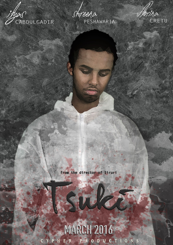
FINAL POSTER:
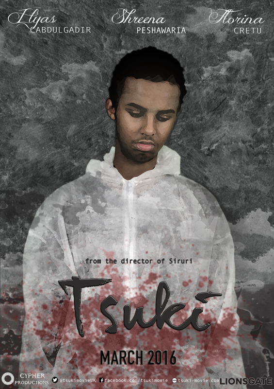
FINAL POSTER WITH TAGS:
Film Poster Analysis
In this page, my group and I have decided to use three main film posters for both inspiration and as a part of our research in analysing the different aspects for each film.
By analysing three professionally produced film posters from box-office successful texts it both helps us to agree on a certain layout and derive ideas for 'Tsuki's' film poster aswell. In order for the research to be relevant, we chose films that would directly connect with our film in some way or another. For example, by choosing Oculus, which contains both Thriller and Mystery sub-genre elements in the plot, it is similar to ours which will simplify the process of attempting to extract tips and techniques that they have used in their film poster.
Additionally, Shutter Island contains some aspects of Crime in its genre which is similar to ours, therefore making a more relevant connection when analysing its concept.
Finally, the last film poster I have analysed is that for Sherlock Holmes, which although contains comedic aspects to it's genre, it's colour coordination and positioning/ posture of the protagonist and antagonist are also what inspired us when taking the official photographs for the film poster for 'Tsuki'.
Oculus (2013)
Although this poster contains a very minimal amount of content, it's simplicity and hidden meanings which stimulate thought from its viewers is possibly the best factor about it. Through its dark connotations of black shadows and eerie looking objects such as the mirror and the posture of the girl pulling herself out only reveals a bit of what the film would actually discuss in its plot. This proves that the poster has been produced well enough for viewers to question hidden meanings behind the images which in turn motivates them to go and watch the film.
This is why my group and I decided to analyse this poster as part of our analysis as it also helps inspire us when creating the film poster for our teaser trailer of 'Tsuki'.
This is why my group and I decided to analyse this poster as part of our analysis as it also helps inspire us when creating the film poster for our teaser trailer of 'Tsuki'.
|
Considering the name of the movie "Oculus" means a circular opening this could refer to the mirror and its supernatural powers.
Mirrors are usually seen as a gateway or portal to other dimensions or an open door for spirits to enter through to the real world. Also, the mirror's black, serpent-like frame may indicate the female in the image's character in the film. This implies that through objects in the poster they are revealing some aspects of the characters. |
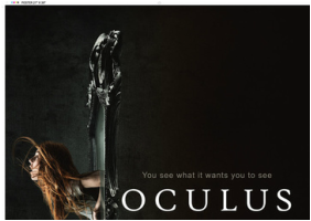
Mirrors are usually related to evil spirits , this would make the audience scared as most homes have at least a few mirrors. The image in the poster could represent the "good" and "evil" battling against each other through supernatural forces as the girl looks as though she's being dragged into the mirror while trying to escape.
|
A grey colour is used for the release date and the small caption, "You see what it wants you to see" suggests that the mirror may has a mind of its own and can control people.
This feature can be used to excite and intrigue audiences as to what the slogan talks about. This is generally done when asking a rhetorical question or referring to something in a vague manner. |
|
As you can see, there is a contrasting colour of white on the left side of the poster and also used for the main title and a slightly grey colour for the date of the release.
There is also an image of a girl attempting to escape from a mirror, suggesting that the mirror is a prime prop within the movie. The girl possibly being a protagonists makes the audience question what is happening in the poster, why she's emerging from the mirror or why she was inside it in the first place. |
The release date and the credits have been seperated possibly due to each element seeking its own attention for a purpose. The date is clear for viewers to see from afar, and is placed in the middle of the poster for an extra appealing factor.
|
This poster is relatively simple in terms of the lack of colour, mostly the colour black is used and the dark shades of green for a Gothic theme and this sets the conventions of horror by using dark elements in order to make the audience feel at edge.
Also, it has given us viewers the impression that the mirror is placed in an isolated area placed on wooden floor. By portraying this, we are aware that the female character is playing a 'damsel in distress'. |
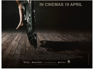
Shutter Island (2010)
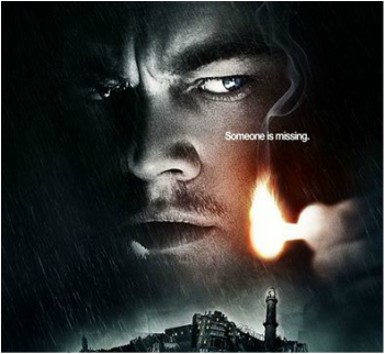
Shutter Island is another Thriller film that we wanted to use as part of our poster analysis. This film's simple yet effective design has inspired us to adopt some of its aspects into out poster. This includes the solemn posture of the character who appears at the front, the dark colours and blue hues that contain connotations of mystery. Also, the lighting of the match slightly connects with our teaser trailer scene when Ilyas is sat in a forest and blows out a lighter. This gives the impression of a sense of loss and possibly grief, two of the main emotions that our protagonist is supposed to feel for the main plot of 'Tsuki'. We have analysed this poster in 2 sections, breaking down the colour scheme, layout and other significant elements to be considered in a film poster.
Furthermore, we decided to use this as part of our analysis as it has been well constructed in terms of content and suits our ideal image of how we want the poster to look like.
Furthermore, we decided to use this as part of our analysis as it has been well constructed in terms of content and suits our ideal image of how we want the poster to look like.
|
The image depicts and island and a manipulated image of the actors face in which we guess is the protagonist of the film is set in low lighting.The surrounding colors are all dark which is a convention of the thriller genre.
The audience will realise that the film is set on island: islands are cut off from the rest of the world and are a good and typical location for thrillers, usually meaning someone or a group of people are trapped in some way. |
|
Across the picture of the actor's face there is a tag line that reads, "Someone is missing." which adds to the narrative of the plot but does not give too much away.
The positioning of the text makes it seen even though it is small its powerful. Psychological thrillers use the posters to their advantage in order to grip the audience as they cannot reveal the plot. |
|
The island is made up of a montage of images that are distorted which could suggest that nothing is as it seems, the image of the stormy sea creates a depressing atmosphere for the audience foreshadowing later events in the film.
The name "shutter" could refer to the shutter of a camera or shutters on windows , therefore something shutting open and closed. This in turn is sinister and creepy for the audience especially viewed alongside the images. |
The film title sets the scene for the genre of the film as it is mysterious and ambiguous set in a red sketchy font and the red connotes blood, at the bottom of the poster the month of the film release is also in red to catch the viewers attention as it stands out. The billing block at the bottom of the poster is in white which contains the names of most of the people involved within the movie and production of it including the distribution companies producers etc. which adds credibility to the film and its release.
|
The text above the title is the actor's name "Leonardo DiCaprio" in bold white lettering, this will attract many of his previous fans and new ones on top of the fans of the thriller genre.
Dicaprio is also known for his successes in previous movies making the viewer rating much higher for this reason only, while the director's name above his is in smaller and compressed text that you can hardly see. |
Sherlock Holmes (2009)
Here I have included another relevant piece of research that I have collected for the poster inspiration analysis. Sherlock Holmes is also featured in my research section and i have also used it as an example for my magazine analysis. This is due to Sherlock Holmes corresponding with our teaser trailer 'Tsuki's' genre which is of a Thriller/ Crime.
Although this film contains aspects of comedic performance which isn't what my group and i aim to present through our trailer however, the film poster for this film specifically caught my eye as I like the design, layout and colour that the editors have used.
Although this film contains aspects of comedic performance which isn't what my group and i aim to present through our trailer however, the film poster for this film specifically caught my eye as I like the design, layout and colour that the editors have used.
|
The two actors placed in the middle of the poster indicate their status and significance in the film and notifies viewers of what personality they have. This particular poster features Robert Downey Jr. and Jude Law, two main protagonists of the film. This is evident also due to the titles including their names above the main title of the film.
By portraying these two characters so openly, they have automatically attracted many people due to the actors' popularity and handsome expressions. |
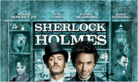
Also, the title written in bold capitals and is named after the world's most renowned and respected investigator/ detective to exist.
The character's heads are blocking about 1/3 of the title however, it does not need to be shown fully as many people are already aware of who Sherlock Holmes is. This suggests that the actors are the prime aspect of the poster, as they are the main source of appealing to the potential audience. |
Behind or 'beside' the two main characters are other actors of the film placed in small boxes. This automatically implies their status which is shown to be not as high status as the main ones. Also, the names of Rachel McAdams and Mark Strong are placed at the top of the film poster. By featuring this, the film has collected a wide demographic of audiences, each belonging to the fanbase of at least one of the actors if not all of the actors combined.
|
|
The Sherlock Holmes film poster was used as a strong inspiration for our group and this was due to its heavy indications of Thriller/ Crime themes, both in terms of colour, layout and design including the posture of the characters photographed and how they are being presented through these images.
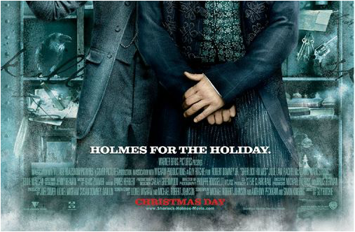
The slogan of the poster directly links to the release date of the film which is placed at the bottom of the page in bold, capital red font, almost standing out completely from the rest of the poster elements. |
The dark blue, metallic themed design makes the background of the poster almost look as though it has been printed over a steel wall with pins. This gives the image the 'rough' effect that many Thriller films aim for, giving the audience an impression of mystery, which is also accompanied by the facial expressions of the characters.
The blue and grey colours also add connotations of a throwback feel to the 19th and 20th century, around the same time of Sherlock Holmes' story. This also informs audience of the context of the film plot which is based around the Industrialisation era. Many viewers are fans of this and this is another way that the editors of this poster have appealed to a wider audience. |
Jude Law holding his old fashioned walking stick behind his head and Robert Jr. crossing over his hands are both light-hearted postures.
The editors of this poster have clearly considered the audiences perspectives and first impressions of the how the film might be like, therefore attracting more people to find out by watching the film. The smokey effect that surrounds the production, distribution and exhibition information at the bottom half of the page gives a wintery and christmassy vibe which works with the release date period. |

