Question 1: In what ways does your media product use, develop or challenge forms and conventions of real media products?
Question 2: How effective is the combination of your main product and your ancillary text?
Upon completion of the main product and the ancillary text, it is clear that both work jointly to emphasise the effectiveness of the film plot and the way it was been produced.
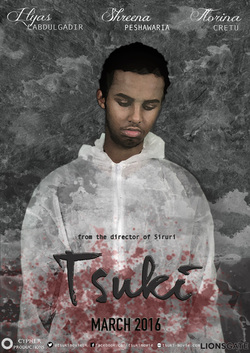
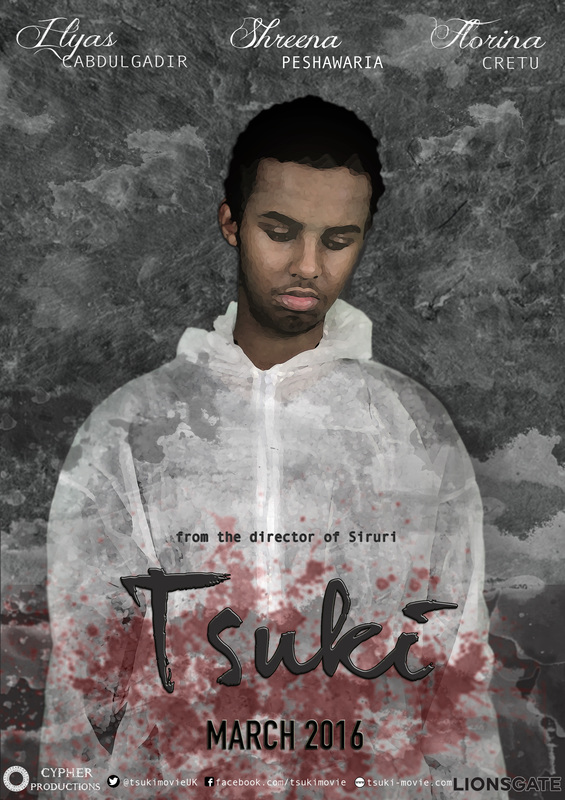
Not only does including a poster and magazine cover add to the professional image of the media products but it also gives the impression of realism towards the audience as it has been marketed in many ways; both a film poster and magazine cover.
My group and I have attempted to create all three products with the intention of them all linking in some way or another. This could be seen with the teaser trailer, film poster and the magazine, which both have similar elements such as colour schemes, fonts and the same image of the character appearing the in one of the scenes of the teaser trailer with the same costumes and essentially 'the look' at which the protagonist appears to be is all similar in each of our ancillary texts.
This was done in order for us to notify viewers that each of these products are linking to the same subject, a technique which many box-office successful films tend to create.
The combination of the three products each means that they contain a concise connection with eachother and I will be showing this through some screenshot images.
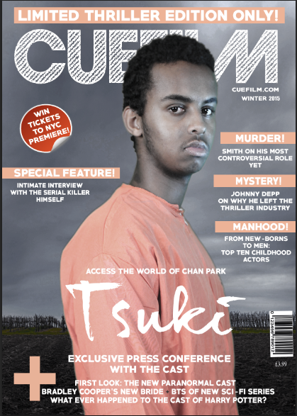
The first I will be discussing is the film poster and the magazine cover, which I had participated in the creation of and connected some of their elements to each other purposefully in order for it to be obvious that they are discussing the same product which is our teaser trailer for 'Tsuki'.
In this first image, we have the title for our film poster which is written in a font named: and we have collected this from a font website which has aided us through many of our products writing due to our inability to find a professional and suitable looking font design that would fit what we wanted for the teaser trailer.
As you can see, the font reading 'Tsuki' in this image of the film poster is written in a joint method and placed almost in the same position as the magazine cover is, which appears in the same font and colour of the film poster itself.
When creating the magazine cover, I began with maintaining the same font as the rest of the magazine cover elements such as the bold white, chunky font of the masthead, skyline and cover lines.
However, after going over my research of magazine covers including the anchoring text, which usually includes the film titles that are being featured, I realized that many contained the same style as the original film title. I decided to use this as an inspiration for my magazine cover and therefore used the same technique as my research magazine covers had used.
This indicates that through a simple use of combination between each of the products, we are able to present all of them as products created or inspired by eachother.
The two images that i have used as an example of effective combination are placed below and it is visible that the font colour, style and even position has been used as an effect to show the connection between the media products and that they have all been created and inspired from one product which is essentially, the teaser trailer for 'Tsuki' itself.
Not only does including a poster and magazine cover add to the professional image of the media products but it also gives the impression of realism towards the audience as it has been marketed in many ways; both a film poster and magazine cover.
My group and I have attempted to create all three products with the intention of them all linking in some way or another. This could be seen with the teaser trailer, film poster and the magazine, which both have similar elements such as colour schemes, fonts and the same image of the character appearing the in one of the scenes of the teaser trailer with the same costumes and essentially 'the look' at which the protagonist appears to be is all similar in each of our ancillary texts.
This was done in order for us to notify viewers that each of these products are linking to the same subject, a technique which many box-office successful films tend to create.
The combination of the three products each means that they contain a concise connection with eachother and I will be showing this through some screenshot images.
The first I will be discussing is the film poster and the magazine cover, which I had participated in the creation of and connected some of their elements to each other purposefully in order for it to be obvious that they are discussing the same product which is our teaser trailer for 'Tsuki'.
In this first image, we have the title for our film poster which is written in a font named: and we have collected this from a font website which has aided us through many of our products writing due to our inability to find a professional and suitable looking font design that would fit what we wanted for the teaser trailer.
As you can see, the font reading 'Tsuki' in this image of the film poster is written in a joint method and placed almost in the same position as the magazine cover is, which appears in the same font and colour of the film poster itself.
When creating the magazine cover, I began with maintaining the same font as the rest of the magazine cover elements such as the bold white, chunky font of the masthead, skyline and cover lines.
However, after going over my research of magazine covers including the anchoring text, which usually includes the film titles that are being featured, I realized that many contained the same style as the original film title. I decided to use this as an inspiration for my magazine cover and therefore used the same technique as my research magazine covers had used.
This indicates that through a simple use of combination between each of the products, we are able to present all of them as products created or inspired by eachother.
The two images that i have used as an example of effective combination are placed below and it is visible that the font colour, style and even position has been used as an effect to show the connection between the media products and that they have all been created and inspired from one product which is essentially, the teaser trailer for 'Tsuki' itself.
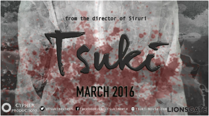
For both titles here we used the Dear Joe Hannes font from a website. We believed that the joint words, and the sharp edges fit the mysterious concept and posture that the protagonists portrayed both in the photograph and through his character's personality in the teaser trailer. The only difference between this title and the magazine title is the colour and the three dimensional effect to make it appear as though it is popping out from the image.
|
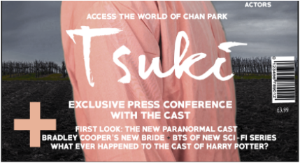
This is the title of the magazine cover, which also is written in Dear Joe Hannes font. However, this is a two dimensional effect and instead of metallic black of the teaser trailer poster, I decided to aim for a more simple effect and filled it with a simple colour: White.
These two images are an example of how their combination works together to reveal a connection between the main and ancillary texts.
|
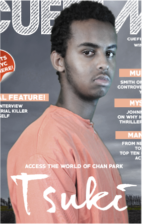
As for the combination of our teaser trailer and the magazine cover both together, there are a few elements which are also similar. This is shown in the main photograph of the magazine cover and a scene which has been included within our teaser trailer. As you can see in the images below, Illyas is wearing an orange jumpsuit which has been worn to imply his arrest by police and foreshadows his escape from prison as he wanders around whilst wearing the same clothes.
I have used this as a similarity between the two products as I believe the scenes in which Ilyas is shown wearing the orange jumpsuit is one of the main aspects of the plot as it reveals his imprisonment after crimes and his fleeing from the police force, all which are significant points that we have portrayed in our Thriller/ Crime teaser trailer for 'Tsuki'. This is why I decided to photograph Ilyas wearing exactly the same costume which will ultimately be an obvious feature of the magazine cover as it would relate to the film trailer itself.
When deciding what the character would be wearing, how he would be posing and what effects I would be adding to the magazine cover, I wanted it all to clearly depict some sort of relationship between the main product and the ancillary text. I also wanted Ilyas to stand in a posture that would be presented in a simultaneous presentation as the personality of the protagonist is shown to be in the film itself.
Chan Park's personality was mysterious, solemn and mainly depicted as angry, which is shown in the teaser trailer through his performances of twitching his cuffed hands in the interrogation interview, flipping the table and being sat in an empty , wet forest alone, all which have been done purposefully to indicate to the audiences that Chan Park's character is a hurt and depressed character.
This acts as a connection with the posture that Ilyas stands in on the magazine cover, his face seeming serious and looking at the camera from an angle, and this was done in order to create the effective similarities between our products so as to show our viewers that each product is discussing the same plot and story.
In the images below, I have inserted the shots that were included in the film trailer which shows Chan Park wearing this orange costume, and I have also inserted the image of the magazine cover and how their combination of eachother creates the effective 'similar' look that I wanted to give when planning and researching for my product.
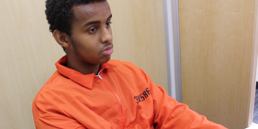
This is a screenshot from the scenes of the interrogation room and it was this image that the protagonist portrayed through his angry personality and solemn looks that I decided to use for inspiration when creating the ancillary text.
Although the contrast has been decreased in magazine cover image, it is clear that both images show Ilyas wearing a prisoners costume.
This is also another example of how through the combination of the two texts have been designed to notify audiences that they both speak about the same film.
|
|
After discussing the similarities between two of the products, I will now discuss how the combination of all three and their connections to each other has influenced the overall presentation of the both the main product and the ancillary texts as a whole.
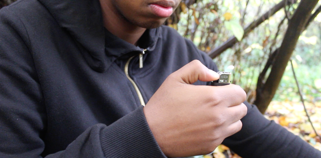
In the teaser trailer, the atmosphere of the environment in which the protagonist and the rest of the actors are shown in are shown as dark, dull and giving off sad emotions which work simultaneously with the plot of the film, as Chan Park slowly loses his mind whilst getting lost in his own world.
This is shown through scenes in the trailer where he walks alone amidst a dark, green forest, clearly having escaped and having nowhere to go. This ends with a shot of him in despair; his head in his hands and isolated/ lonely.
This effect was done on purpose to show his loss of grip on the outside world and a creation of his own reality after murdering all those victims that are later shown in the trailer as well. The images below are screenshots of these scenes which connect well with the background of the magazine cover and film poster.

|
|
During the creation of the film poster, we wanted to present a similar atmosphere of isolation, darkness and homelessness, each accompanied by his own posture of mystery and insanity. This can be seen in the dark grey background and a splatter of blood which is shown in the film poster, placed below. Also, by the character looking down, viewers sense a feeling of shame and resentment, two of the main emotions Chan Park depicts in the teaser trailer for 'Tsuki'.
Also, the combination a white suit and dark background juxtaposes the different 'faces' of Chan Park and how he can feel sympathetic and weak but also ruthless and vicious. This shows that the combination of the 'depressing' atmopshere that is portrayed through the character's performance in the teaser trailer also works jointly with the pose of the same character in the film poster. Also, the colours that accompany these elements to give the viewers a well-connected feel between all of the products that we have created together.
This is another way in which the main product and one of the ancillary products, the film poster, have worked together to give a more effectively dramatic feel than if they were to be released on their own as a sole product.

|
|
Another connection between the main product and the other ancillary text, the magazine cover, similarly fits to the connection between the other two that I have previously discussed. This includes the dark and dull atmosphere that both the teaser trailer and the film poster portray, each with their dark tones and serious expressions that the protagonist shows through his performance.
In the magazine cover's background, in which the main image and the rest of the elements are placed, the deep contrast and the dark hues and saturation of the forest match both Chan Park's personality which is shown in the teaser trailer and the theme that the film poster present together. This is also seen in one of the most significant locations that we filmed which was the forest.
As the group member who was responsible for the overall design of the magazine, I wanted it to also join with the rest of the products and show a clear connection between each of them. This helps viewers realise that they are all generated from the same source and that they each work together to create three separate products relating to each other in one way or another.
For both teaser trailer, magazine cover main image and background and the film poster, we added a slight blue filter and de-saturated the image colour to give a more serious and dark feel. Also, by changing this we have related our Thriller genre of the teaser trailer to this aswell.
Below I have also inserted images of how all three products have been combined to present a certain image that would make each of their features stand out together.
|
|

|
|
Question 3: What have you learnt from audience feedback?
During the creation of my ancillary text which was the magazine cover, I faced a situation in which I had to choose between two different designs and concepts of the overall product. As both were similarly appealing, my group and I could not choose between them as easily.
This is when I decided to include my audience into the decision and created a mini-survey on Facebook which allowed me to ask which one was more suitable and which one that they liked best. This included approximately 30 people from my Facebook account and I had them answer the question.
I inserted two of the images of the covers and asked 'Which one looks better/ more professional?'. This helped me decide on which one to include as an official magazine cover for my media product to be submitted in with the other ancillary texts of the group.
Not only is this gaining feedback from people who are observing my work but also gaining constructive criticism from honest people who have helped me decide on what they like rather than what I alone think looks better. Gaining feedback from other people is one of the most important aspects of attempting to improve or add on to my product as I am taking into account the perspective of those who are not earning a grade out of my work and therefore proving to be a more honest way of collecting other's thoughts and feelings about my work.
The comments that were included in the Facebook post such as looking at other magazine covers for inspiration also helped me to add on elements within the coverlines that i would not have considered with my research alone. This also proves that considering feedback from audience can not only help me improve my work but also add on things that would gain me marks after being submitted.
The reason I have created this post was not only to include my potential audience in the project, but also because I personally couldn't figure out which magazine cover outdone the other and whether or not they were suitable for the film 'Tsuki''s teaser trailer either. I have inserted both of the images below.
Image One shows the magazine cover without any of the cover lines, just a simple layout of the elements that were essential to include. This has been inspired by my research for the magazine which includes the famous contemporary magazine 'Sight & Sound', which also doesn't use many cover lines, if any at all, and this magazine inspired me to recreate a similar style, as shown below.
However, after creating this magazine cover, I realised that there needed to be more content in order for my audience to be attracted to it. Also, by including as much magazine cover terminology elements as I could, I would be able to gain marks out of it, and it would attract the readers beyond the image of Chan Park as the main image, which is also an opportunity to gain more buys for a magazine as it would.
This perspective drove me to create another copy of the magazine but this time, using the mainstream magazines as inspiration, which are usually rammed with content such as a large puff, covermount, skyline, many coverlines and other elements which all contribute to the attraction of both the cover and the content placed inside the magazine, even though I will not be creating the interior, I still thought that by including other stories featuring articles inside, it would show that I have considered a wider range of audiences instead of just focusing on one for 'Tsuki'.
This is when Image Two comes in, which clearly shows a lot more content than Image One and in my perspective, looks much better than an emptier magazine cover, which could eliminate my chances of appealing to a larger demographic of audiences. In the comment section of the Facebook post, I had suggestions from my followers to add in certain content that they thought would appeal to more people. I took this into account and used their advice as a pin-point for starting a new and more full magazine cover which reveals more terminology.
It is clear that I have added a lot more content than the opposing cover. This includes a puff, which is the short phrase that is used to sell the name of the magazine such as 'FREE TICKETS TO NYC PREMIERE' which will attract film lovers who are interested in these activities. I also added coverlines and this helped create a fuller effect within the magazine cover and this was enough of a difference from my emptier version that gave off a more contemporary feel instead of a mainstream one.
The theme of the colour schemes and the layout of Image Two also creates the impression of mainstream magazine, hence its name, which shows that it is more enjoyed by audiences than if it were to be empty like the first magazine cover I created which was of a more simpler layout.
The audience have contributed to giving me feedback in many ways, not just by suggesting which image looked better, but also constructively criticising my images and helping me to decide on which one to include as my final ancillary text. What I have learnt from the audience feedback is that they give me an insight into perspectives other than my own, which shows that by considering other people's opinions, it could help me with my work positively and create a product which is much better than my first.
In the image below, I have included the Facebook post that reveals the comments and queries that other people have given me and which have contributed to my overall decision of choosing Image Two as my final ancillary product.

