FINAL MAGAZINE:
MAGAZINE ANALYSIS
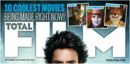
SHERLOCK HOLMES (2009) Total Film Magazine (Mainstream)
In this section I will be analysing the magazine cover for one of the films that I included in the sub-genre research section of this website. This is relevant as I am able to correspond my initial research, my magazine analysis and the poster analysis and I will have similar elements to discuss when creating the magazine.
TOTAL FILM magazine is a UK based magazine which publishes every month, and features box-office successful films such as these. Having a wide range of readers, this magazine both informs and entertains its buyers whilst promoting the film well, through articles and information about the actors and overall plot of the film.
In order for our group to create a professional looking magazine cover, I research well established magazines which inspired us and helped us come up with an idea of the layout of the magazine cover and how to include the elements of the magazine to suit our genre of a Crime- Thriller.
The following is an image of the September 2009 issue of TOTAL FILM, along with descriptions of the magazine terminology which includes: Airbrush, Anchoring Text, Connotations, Cover lines, Covermount, Masthead, Main Image, Mode Of Address, Puff, Representation, Skyline, Slogan, Strapline, Target Audience.


|
This also features the skyline of the cover, which is the line of information placed on the top of the page and usually runs over the top images.
It is used to relate to what other stories there are inside the magazine and it is clear that Total Film have also included three other small images to give readers a sneak peek. Similarly, the mode of address of the language here is direct, therefore readers feel more encouraged to purchase this magazine as they feel as though it is directed towards them. |
The background of this image from the top fades from dark blue to light with an ombre effect. This has connotations of masculinity, which reflects with Downey Jr.'s personality both in the film and out. Also, blue depicts a cool, casual tone for the magazines atmosphere, also agreeing with it's calm use of effects and captions.
|
This is the masthead of the magazine cover which is one of the main aspects of the design as it informs readers of magazine name.
Although it is being slightly covered by Robert Downey Jr.'s head, target audience will already know of the house style hence why they aim to promote the actors face more than the logo of the magazine because we are already aware of what magazine it is. Below the masthead in very small font states the issued date of the magazine along with a price. Under the masthead on the right shows the magazines website, another way in which potential readers can interact. |
|
This is the center section of the magazine cover. In the bold, bright captions reading: 'BASTERDS!', 'SNEAKY!', 'EXTRA!' we see Cover lines, the words which surround the main image and here is what includes the main aspects of what will be featured in the magazine the most.
Not only do these cover lines attract attention due to size and font but also due to the colloquial meaning of the words themselves is what interests the readers to see the article behind them. |
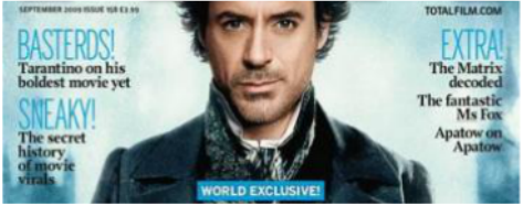
Although TOTAL FILM editors have only included 3 cover lines, they have balanced out the interesting content of the front cover with the actor's handsome face, which has clearly been done with the help of manipulation using airbrush techniques.
As the person is the most significant part of both the magazine and the film itself, the position in which the image is placed and its hue, saturation and colour are extremely important. Here, TOTAL FILM has clearly created his image well, with vivid colours and clear quality. |
The middle of the magazine cover you will find always includes the face that portrays the film well i.e the protagonist of the film that is featured in this magazine. This is called the main image. Here we see Robert Downey Jr. dressed in his Sherlock Holmes character, and this was done to both attract fans of the film and of the man himself. This is an essential element when wanting to gain as much target audience as you can to buy the magazine as you are widening the variety of readers.
|
|
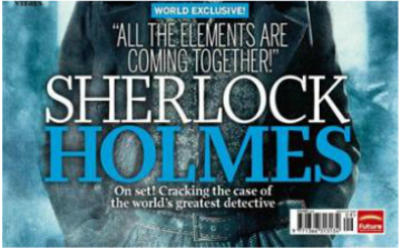
This is the bottom half of the magazine cover, which features the most important part of the entire sheet. This includes the Anchoring text, which gives meaning to the picture, which in this case is the large font reading 'SHERLOCK HOLMES' and the brief information which follows. Anchoring text both hints the purpose of the article inside the magazine and notifies both aware and unaware readers of the actor/ characters name.
This section completes the magazine cover whilst also presenting the attractiveness of the magazine well. |
It is mainly the bottom right of magazine cover pages which include the barcode and the publishing company of the magazine, a barely noticeable feature which doesn't obscure the significant elements of the cover yet is there to show viewers that it can be bought.
The rest of the characters body hides behind the anchoring text as it is not as important. |
The representation of this half of the magazine is both exciting due to the enthusiasm which is shown through the punctuation of exclamation marks and apostrophes. It is also aesthetically pleasing as they have kept the colour coordination which is a mix of dark and bright hues of blue and white, which occurs throughout the entire cover which looks more professional as they have kept it consistent and neat, which attracts potential buyers. A small blue box also appears above the anchoring text mentioning the magazine's 'world exclusiveness', which reveals to potential buyers its specialty.
|
Harry Potter and The Deathly Hallows Part 1 (2010) Empire Magazine (Mainstream)
Empire is a British film magazine company which publishes monthly issues, established in 1989. It is one of the most popular and widely-read film magazines, and I have decided to use this as research due to its professional editing and box-office success film features.
Below are some of the popular issues that Empire magazine have released over the past 5 years, and I have inserted them here as they each have proved to be successful with the use of essential magazine cover elements to promote both the films and the magazine name itself.
As you can see, they have kept many aspects of their design consistent throughout the various films that they have created articles on. Although they have kept the font of the masthead the same, as it is their logo and are identified through that, they do frequently change the colour accordingly with the theme coordination of the main image.
It is also clear that they tend to fill the cover page with many elements such as the cover lines, the anchoring texts and the large, vibrant main image, however all of this has been done purposefully in order to sell itself to the potential buyers when seen on its shelf.
The magazine that I will be analysing closely is the October 2010 issue which features Harry Potter and The Deathly Hallows Part 1. It is clear that this issue for the magazine is specifically for Harry Potter as it doesn't include a lot of information or images besides it, except for the strap-line at the bottom of the page which reveals an article for other 'MUST-SEE' films.


|
On the top half of the magazine cover it is most common that a Puff will be included, which acts as a short phrase that sells the magazine, in this case we have it over the masthead which is a noticeable position for the readers to be able to identify it straightaway. The capital, bold, highlighted and exclamation marked words also help to catch the readers eyes. We also see some sort of 3D effect as though the wand has broken through glass which also adds to the creativity and realness of the cover.
|
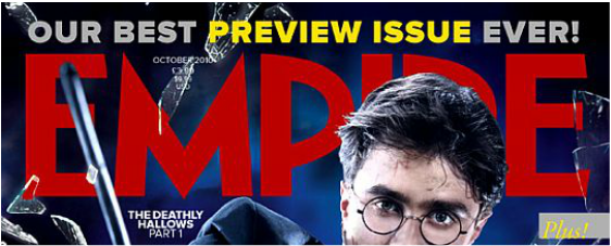
In this magazine, the actor's face is the 'striking object' that is related to the purpose of the magazine which is Harry Potter. We also have a direct mode of address through his gestures as he points the wand towards us and seems to be looking directly at us which could create a sense of communication between the magazine and the viewers.
The dark blue, cloudy background emphasises the theme mysterious atmosphere that the main image gives off, also conforming to the genre of the Harry Potter film, which is of a fantasy, sci-fi sub-genre. |
The masthead is written in red and they have conserved the same font of the usual titles of other Empire magazines. This is because the masthead acts as their logo which helps people identify what company the magazine belongs to.
We can also see that the main image covers the masthead slightly, and this can also be seen in other famous magazines. This is done as the aim of the magazine which is to promote the film. Daniel Radcliffe's face covers the masthead because this film is the main aspect of the front cover, and readers are already aware of the name of the magazine. |
|
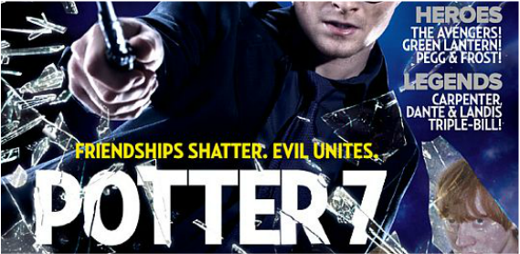
Here we have the middle of the magazine cover page which usually contains the most important parts of the page. There are two cover lines on the right side of the cover, which are there to inform readers of other articles apart from harry Potter in the magazine. However, they keep them short and concise to leave the rest of the attention to Harry Potter.
In the design of the background image they have inserted images of the main actors inside the glass, which is an intriguing way of including other actors into the magazine cover. |
The colour coordination of the cover has been kept consistent throughout and this is visible through the font of the text and the main image's and background.
The mode of address is enthusiastic which helps readers give a positive perspective of what is to follow inside the magazine. The target audience is clearly called out to due to the large anchoring text saying Potter 7, which accompanies Daniel Radcliffe's face in informing readers of the magazines prime feature. |
We also have the most important part of the promotion of the film and the article which is the anchoring text which overall, gives the main image meaning and gives a hint at the article featured inside the magazine.
Here, they have used the expression: 'Friendships shatter. Evil unites, Potter 7' which basically indicates the main plot of the film which is primarily based on the question of: 'Will evil triumph over good?' This can be interesting for both Harry Potter fans and non-fans. The image is of sharp, high resolution which presents the magazine name as professional. |
|
This is the bottom half the magazine cover which is supposed to complete the image. Empire magazine has served its purpose of promoting the film well as they have inserted the other characters further into the bottom half in glass that has been shattered by the main image. They have chosen pictures which depict the charcacter's personalities of the film well, which are anguished and raged. Additionally, Empire have also used another expression saying 'The end begins' in large capital letters which both entices and attracts readers due to its quirky meaning.
|

The barcode is placed in its general position which is in the corner where it doesn't obstruct any of the elements but is visible enough for the buyers to be able to view it. Also, we have the strapline of the magazine cover which runs over the top images and summarises the overall content of the interior of the magazine whilst listing other stories that are featured along with Harry Potter. This is important as it may attract those who are not so much into Harry Potter but would be interested in other stories.
|
The strapline also works alongside the cover line captions and generally advertises what they have mentioned at the top of the magazine.
We can also see that the background of the main image also gets darker by the use of the ombre effect and this is used to accompany the evil, dark character of Voldemort as is shown in the shattered glass over it. Black also has connotations of negativity and sadness, something that the article Empire has created will discuss inside the magazine. |
Sweeney Todd (2007) Entertainment Weekly Magazine (Mainstream):
Entertainment Weekly is a Time Inc published magazine which covers the varieties of media such as film, television, reality, broadway theatre, books and popular culture. Founded in 1990 New York, the year in which its first issue was published, Entertainment Weekly has been releasing various issues for 25 years.
Below are the many popular issues that this magazine has released over the past few years that gained them more readers and profit due to the popularity and box-office success of its featured article films.
The distinguishable features of this magazine are consistent, which include bright, sharp images and very few coverlines that accompany the image. Also, the editors tend to base the attention of the front cover mainly on the film that is being featured on it. For example, below we see the the magazine cover for Maleficent contains few coverlines, straplines and puffs, which mean that they have relied entirely on Angelina Jolie's face to capture the attention of the viewers.
Furthermore, the masthead of Entertainment Weekly magazine conserves its font, but frequently changes colour. This indicates a sense of creativity and interesting sense of portraying the magazine's name, a feature which serves the magazine company well as they don't keep to one colour scheme and change it accordingly with the film that they are featuring.
Further below is my analysis for the Entertainment Weekly magazine cover in it's November 2007 issue for Sweeney Todd, starring the popular and well-respected actor Johnny Depp.


|
This is the top of the Entertainment Weekly magazine cover for Sweeney Todd, which features Johnny Depp on the cover. Already, the magazine has captured fans of the film as this actor has a set fan-base which adds on to the fans of the magazine, hence resulting in more buyers.
Here, we have the masthead of the magazine cover which is in large blue font, joining in to the colour schemes of the background and the main image. Unlike other magazines, the masthead lays over the main image, blocking out a section of the actor's head. This is acceptable as it is not obscuring anything significant such as his facial expressions which is permissible for this type of magazine. |
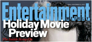
Below the puff, there is a caption mentioning: 'The Inside Scoop On' which is a rather popular line shown in many magazines which mainly bases itself around the 'sneak-peek' of the film and is supposed to reveal unknown facts about the film such as Behind the scenes.
This is done to intrigue the audience and persuade them to carry on reading further into the magazine articles. The date of this issue is also written in it's usual place which indicates that the magazine has kept most of it's layout consistent to match with the other magazines. |
The puff 'Holiday Movie Preview' which appears at the bottom left of the masthead, in it's usual place, is typed in a rather larger font than normally, and this may be due to its important role in the participation of promoting the magazine.
Written in large white font, this also lays over the main image, but on another insignificant part which means it is not blocking the view of something that would potentially add to the promotion of both the film and film article. |
|
This is the middle section of the film magazine and it is also clear that they have left the attention on Johnny Depp's face as there are no coverlines or captions beside it.
This may be seen as a negative factor as they left the most important and eye catching section of the magazine completely empty, except for a large coverline mentioning the 39 New Films, which they have kept the colour scheme similar to the masthead and puff, and this may relate to what will be shown at the bottom of the magazine. And this is something that my group and I will try to avoid when creating the magazine cover. |
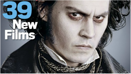
The grey, dull background also contributes to the overall simplicity of the cover which then again doesn't give the readers much to look at apart from the actors face.
Also, grey suits the colour coordination of blue and white, as it is a flexible colour when inserting it into a magazine cover as it will suit everything, especially in this case, as Sweeney Todd's costume is partly grey, partly white. This has connotations of dullness and mystery, exactly what the film genre portrays. |
The main image of this magazine cover is Johnny Depp portraying his character of Sweeney Todd and solemn, angry facial expressions which reflects the personality of the protagonist.
His pale makeup and dark undereyes staring directly at the camera which suggests a direct mode of address between the main image and the viewers which creates a sense of communication between them. |
|
The bottom third of the magazine cover is slightly more filled with magazine elements that help with the advertising of the magazine and other film articles within the magazine.
The anchoring text of the magazine is written in large white font, which as well as the main image being obvious that it is one of the most influential actors, the anchoring texts reassures readers of this fact. There is no obvious strapline included about the film itself, however, the bracketed In Sweeney Todd phrase implies what the story of the article is about. |
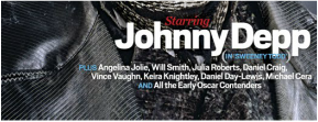
The background of this text appears to be the rest of Sweeney Todd's costume, which seems to suit the rest of the grey, white, blue colour scheme.
Also, the colour grey again reveals the connotations of glum and a dark mood, exactly what Johnny Depp's acting gives off in the film. This magazine altogether aims for a target audience of a wide field of actors and actresses, hence resulting in many buys from a wide range of customers. |
Below the anchoring text there are smaller sub-headings that mention other famous actors names and this may attract fans of those actors to buy the magazine.
Therefore, by listing these names, the editor's have widened the demographic of buyers as they have included many different actors and 'all the early Oscar contenders. The word that is placed above the anchoring text says: 'starring' in italic, red font and this helps emphasise the word which lets readers know that the person that is going to be discussed in the magazine is significant. |
Wise Blood (1979) Sight and Sound Magazine (Contemporary):
Sight and Sound is a contemporary British film magazine published by the British Film Institute and founded in 1932. This magazine features many arthouse films with a limited release opposed to other magazines such as the ones I analysed above which tend to focus on the films with a general release.
This magazine also features a full cast and crew credit list for each of their reviewed films and also gives off a very different vibe compared with other mainstream magazines which each rely on ultimately the exact same layout and colour scheme to attract a wider range of audience. However this magazine tends to aim for the same variety of target audience, those who like a simpler more authentic design and a magazine which discusses films through a more professional and in-depth analysis rather than a easy-to-understand concept.
This magazine also features a full cast and crew credit list for each of their reviewed films and also gives off a very different vibe compared with other mainstream magazines which each rely on ultimately the exact same layout and colour scheme to attract a wider range of audience. However this magazine tends to aim for the same variety of target audience, those who like a simpler more authentic design and a magazine which discusses films through a more professional and in-depth analysis rather than a easy-to-understand concept.


|
The top third of this magazine cover displays the masthead and the slogan which both appear to be rather simple in terms of explanation and content.
The slogan appears in white, capital bold font, an eye-catching feature which lays among darker colours and designs. 'THE INTERNATIONAL FILM MAGAZINE' are the few words that every Sight & Sound magazine includes which gives the name a unique selling point. This allows readers to be able to identify what kind of magazine it is even before they have started reading the rest of the page. |
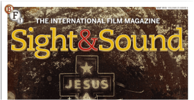
Although we cannot determine the basis of this magazine from the top third, the main image, which also acts as a background, indicates the genre of the film that they will discuss which is the 'Southern Gothic' genre of films.
This is due to the Sepia effect that the picture has been taken with, and viewers are notified of it's 'old' theme. |
The masthead of this magazine is noticeable due to its large size and coral colours which tend to capture attention without including too much design or colour.
Although this masthead is different compared to other Sight & Sound magazine, it has essentially maintained its orange-red colour scheme which helps fans of this magazine identify the name. The BFI logo is also placed beside the skyline so as to promote it's own name and the fact that it is the publisher of this magazine. |
|
The middle-third of the page essentially contains nothing, similar to what we have seen in my other analysis of Entertainment Weekly Magazine for Sweeney Todd, and this is done to put all the focus onto the main image. We see a religious theme occurring throughout the cover, as indicated by the church which has been blended in with the man, the image of the church and the text that appears to say 'Bless The Lord', most probably talking about Jesus.
|
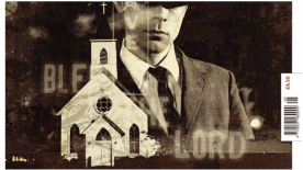
The 19th century concept that this image gives off gives the readers a nostalgic feel due to its dark, brown colours and also the man's old fashioned suit helps portray it's Gothic connotations.
The images have clearly been blended well together without ruining any of the image's qualities. |
The man placed in the main image portrays a mysterious guise as he stands there with a dull expression and his 'cowboy' hat covering his eyes.
This could be done to indicate the character's personality, the prime feature of the main image which is supposed to be of a striking object and in this case, this man is exactly that. The barcode is the only feature of the middle of this magazine which doesnt include the main image, and it is acceptable as it is not obscuring anything. |
|
The bottom of this Sight & Sound magazine cover contains the most content out of the rest of the magazine, and this has been done in order for the text not to obscure or distract the readers from the greatly composed main image which seems to communicate various feelings.
Here we see the anchoring text written in large, capital white font which stands out against the dull background. It also indicates the film's genre of Southern Gothic, informing the readers of what film the background displays, as there is no obvious indication of the name of the film. |
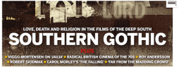
The text at the bottom of the page which could also be considered the strapline reveals other features in the magazine apart from what we are seeing at the front cover.
It seems also that the magazine is going to cover more professional and controversial topics about other films such as 'Radical British Cinema of The 70's' and also other important figures in the art house film industry. |
The strapline is there to summarise the content of the cover and inform readers of any other stories which are featured in the magazine.
The nouns 'Love, Death and Religion' each accompany the main image and relate to the theme that is being reflected here. The mode of address is formal and concise by not giving away too much information but only enough to summarise the content inside the magazine. |
Magazine Layout Plan
After researching successful film magazines, it is essential that I create a layout plan for how my group and I would be able to apply other techniques and inspirations from other film magazines into ours. In order to be able to create a professional looking magazine cover for our teaser trailer, we must create elements that will conform to the sub-genre of our film trailer which is Crime/ Thriller. This means we must apply colours, layout of magazine cover elements and the main image style to all coordinate with eachother to give the overall product a complete and well-connected look.
Although there is already a set out template for magazine covers, I believe that manipulating our own magazine cover layout to suit our film trailer personally will benefit us as we will have slightly opposed to the conventions of a regular magazine cover that you will find in almost everyone else's work. This will help us to stand out and emphasise our character's personality and the film trailer's genre well.
Below I have created 2 simple and concise versions of my actual magazine cover. This could be changed throughout the creation of the magazine cover as it is a first draft. I have also shown the process in which I added on names and actual images and the captions which is shown in the 'Creation of the Magazine Cover' section below.
Drawn Out Sketch of Magazine Cover: First Draft
|
In this template, I have inserted the main elements of the magazine and briefly positioned them into the areas that i thought looked best. This was obviously based on my experience through researching different magazines that are shown above.
Although this isn't exactly how I wanted my magazine to look, I decided to include as much terminology as I could to have a complete overview of what I would be able to include. As you can see, it is clear that i took the mainstream approach in terms of layout as most popular magazines have this kind of design and follow this consistent use of laying out the various elements. |
|
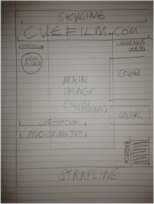
Digital Version of Magazine Cover: Second Draft

|
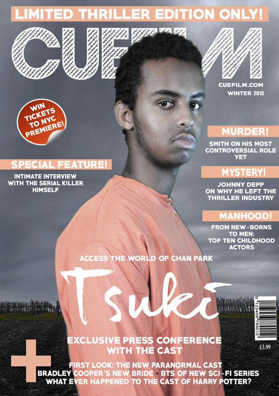
This image is my digital copy of the first draft which is an upgraded version of my sketched version.
Starting with the skyline above the masthead, then other small yet significant elements such as the magazine website link, the price of the magazine and the date of the issue. Also, I inserted a small box to be filled in with a slogan to sell the name of 'CUEFILM'. Below that are the additional and elements such as the puff and cover lines which accompany the main image which will have Ilyas appear on it. On the bottom third of the page the header, anchoring text, subheader, covermount and strapline which all contribute to promoting other articles in the magazine. Finally I inserted the barcode in its usual position on the bottom right. This electronic version of my sketch contains more elements and I have also switched their places to make it look more professional. I will be using this as my main guide when creating the magazine cover on the software. |
The creation of my Magazine Cover
Photography for the main image:
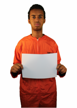
Before I start the creation of the magazine I had to photograph our protagonist for 'Tsuki'. For the main image of the magazine cover I had two main ideas; one of Ilyas holding a white card which I was planning to insert the anchoring text on, for it to appear as though it is the prison sentence information written on it, which usually appears when criminals have been arrested.
However, after editing the images quality, hue, contrast brightness etc. I realised that the idea wouldn't quite work out as much as I had anticipated due to its unprofessional appearance. Also, as we didn't have the correct equipment, Ilyas held an A4 white paper which in turn did not look realistic.
However, after editing the images quality, hue, contrast brightness etc. I realised that the idea wouldn't quite work out as much as I had anticipated due to its unprofessional appearance. Also, as we didn't have the correct equipment, Ilyas held an A4 white paper which in turn did not look realistic.
|

|
Finding a suitable background:
After creating my initial template, I had a brief overview of the order I wanted my magazine cover elements to be organised in and this made the overall creation of it much easier. After planning the content of my magazine cover such as what I was going to write into the cover lines, sky line, puff etc., I began the editing of my actual product.
The first thing I searched for was the background that the magazine was going to be laying on.
This took a lot of time as I wanted to give the effect that the actor was standing within a forest, and a lot of editing took place in order for the image hue to fit. This was because the actor was wearing orange in the photo and orange naturally contains sharp edges and usually makes the image look as though it has been stuck on. This is why I took a long time finding the appropriate background with suitable hues and saturation.
Below I have inserted images of the backgrounds that I was going to potentially use for my magazine cover. And after trial and error I found one that was suitable with what I wanted for my magazine cover.


As you can see in the images above, I have tried all three backgrounds with the magazine cover but ended up not liking it as much due to problems I had with the colour theme that I wanted for my magazine which was orange and white. These colours just didn't go well together so I attempted to carry on looking until I found one that suited both the quality and sharpness of the main image and the colour scheme of the Anchoring text, the cover-lines, the skyline and the puff altogether.
It is clear that I was aiming for approximately the same type of location for my background of the magazine cover which is a dark, empty green forest. This is to correspond with the main product which is the teaser trailer, as many of the locations that we filmed in were based somewhere between the lines of the woods/ the forest.
I believe that connecting the main product with this product helps audience to identify and relate each aspect of the film to the other products such as the poster and the magazine cover that I have created.
|
In this image the grey, simple clouds and the landscape of the fields suits the colour scheme of my magazine.
It also gives the impression that the protagonist is almost 'lost' in an isolated area, exactly what the plot of the character is based upon. |

|
You can see that camera is overlooking a far horizon of what looks like mud before crops grow and leaf-less trees are lined at the end.
This suits the image of isolation and abandonment that I wanted to create a corresponding feeling with the personality of our protagonist, Chan Park. |
Finding the right font:
In order for the magazine cover to look professional or elegant, the font of the cover-lines, anchoring text, skyline and other important aspects in which the text is inserted in needs to be though over carefully and selected well. I decided to use various fonts in my magazine cover as although the layout stays consistent, the font doesn't necessarily have to remain exactly the same as the rest.
This is why I used 3 different fonts for my magazine cover and this was to emphasise the different content and make readers see a wide range of design instead of keeping it the same.

After visiting many magazine font websites and downloading various fonts, I was able to find one that was suitable for the layout of the magazine and one that would also match the fonts of the rest of the text on the cover.
Dear Joe Hannes was my main font for my anchoring text which read TSUKI in large letters across the cover.
|

This font named GoodMorningAfternoon was also downloaded from the same font website as my anchoring text which appears opposite this image. I decided to use this font for my masthead as it is large, bold and stands out whilst keeping the magazine not too tacky-looking.
|
Editing main image: De-saturation, decreasing hue, brightening and contrasting + adding effects
In order for the main image to match the background of the magazine cover, changes had to be made in the quality of the photo. This included de-saturating the colours, decreasing the hue of the orange which was too bright for the rest of the magazine colour scheme. Also, the colours were the main issue during the creation of the magazine as I wanted to keep a consistent pattern of hues, and the uniform he wore made it look unprofessional and as though it were directly stuck on the background.
Similarly, as the photograph was taken in a green room, the reflection of the green light was showing on Ilyas' face, and I did not want the image to look as though it was poorly taken, as this will lose me marks and make it less-appealing when I've finished the magazine cover.
As you can see below, I have inserted a screen-shot image of the Layer panel on the photoshop software, which shows the effects and changes made to Layer 1. Also, the effects can be seen under the image which show that I have added the Outer Glow and Drop Shadow. I have also darkened the background to adjust it with the rest of the magazine theme, instead of keeping it bright and therefore unsuitable to what it is surrounded by.
In the middle is the main image without any of these effects, the image on the far right is after I've added the effects to the image and you can tell there there is a significant change.

|

|
|
Upon completion of my analysis of the creation of the magazine cover for Tsuki, it is clear that I have considered many aspects during the editing of this ancillary text. First of which is the Sketch draft and electronic version of my magazine cover, which have helped me decide in many aspects such as the positioning of text, the layout etc.
Additionally, by analysing my photographs well I was able to improve them and manipulate them in terms of what I saw needed changing.
The font was also a very important part of the creation of my magazine as I needed to make it look professional and not too tacky. The editing of the quality of the image for my main image was also important as the original photo did not look presentable at the beginning but through a lot of editing I was able to make it look more professional.
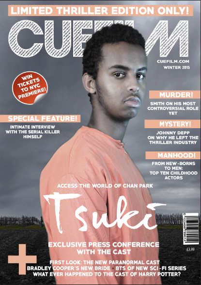
After fixing and removing many of the faults in the magazine cover which I noticed each time I came back to edit, I am now satisfied with the overall result. I have inserted the exported and full-resolution image below.
Additionally, by analysing my photographs well I was able to improve them and manipulate them in terms of what I saw needed changing.
The font was also a very important part of the creation of my magazine as I needed to make it look professional and not too tacky. The editing of the quality of the image for my main image was also important as the original photo did not look presentable at the beginning but through a lot of editing I was able to make it look more professional.
After fixing and removing many of the faults in the magazine cover which I noticed each time I came back to edit, I am now satisfied with the overall result. I have inserted the exported and full-resolution image below.
